improved
new
Campaigns
Email Editor Updates: New content blocks and hide on mobile/desktop option
We've made some changes to our email editor to give you even more flexibility while designing your emails. Here are the updates:
1) Menu content block
- The menu block is a handy feature create text-based navigation interfaces, while mantaining a fantastic experience when rendered on mobile devices. The image below shows an example of a basic horizontal menu on the desktop version and the mobile icon version as well.
2) Icons content block
- With Icons, you can create new layouts mixing icons and images with text, without the constrictions of row structures. A few examples include bullet points, ratings, logos, or property amenities and services, like in the example below.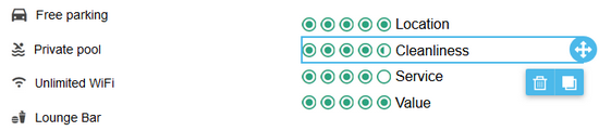
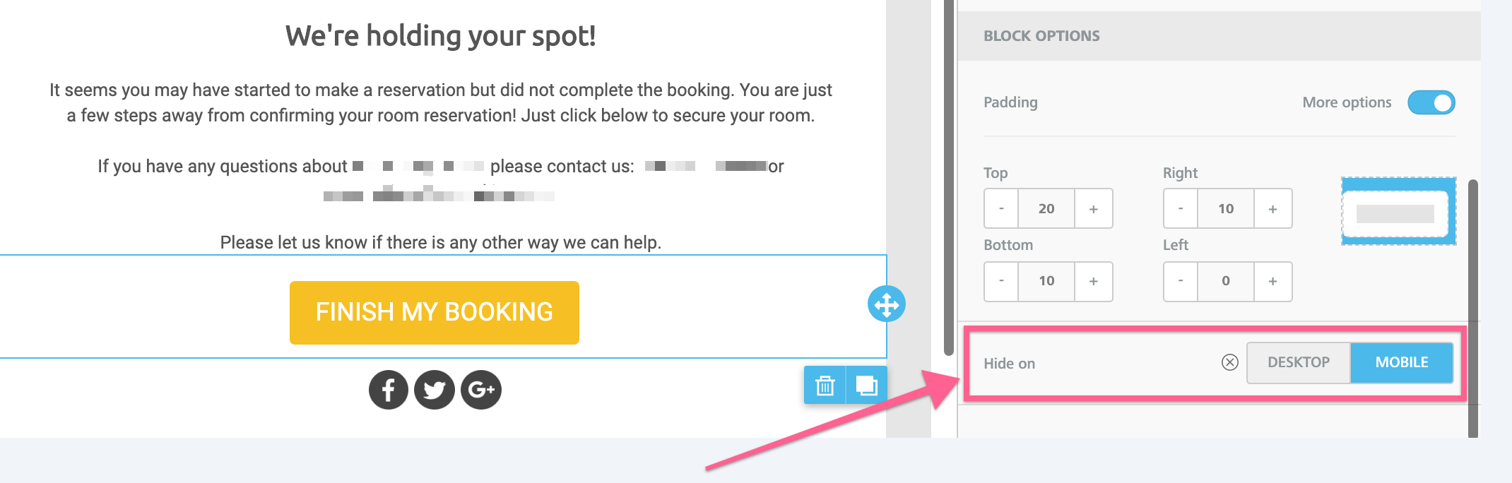
3) Hide on mobile or desktop
- With this new option, you have the ability to hide an element on desktop or mobile devices. This is very usful for more complex designs. To use this option, select an element and scroll down to the bottom of the properties sidebar to the "Hide on" section.